CS-01 · Insurance · Catastrophe risk
Moody's Insurance Risk Platform
Moody's makes the software insurers and reinsurers use to work out what a catastrophe would cost them. A hurricane hits Florida. How much of that sits on your books, how much did you pass to reinsurers, and what is left for you to pay. Three products answer that question at different stages. Risk Modeler runs the catastrophe models. ExposureIQ accumulates exposure across a book of business. TreatyIQ prices and analyses the reinsurance treaties that spread the risk. I led design across all three and the shared layer between them.
The challenge
- Three products, one platform, and a customer base that moves between them in a single working day. Every screen had to feel like it belonged to the same system, while the underlying jobs stayed genuinely different. Work shipped on a fixed release train, versions named after cities, so each feature had to land in a window and hold up against whatever the other two products shipped alongside it.
- Volume was the constraint that shaped every screen. A database holds around 3,900 accounts. A results table returns 4,292 rows across 86 pages. A single group resolves to 320 portfolios, 2,201 profiles and 450 results. You cannot put that on a screen, so the work stops being layout and becomes giving people a way to narrow, describe and check.
- Several of these operations write to the database or commit hours of compute. Converting perils across a book, or running a modelling workflow end to end, changes data that a company will later hold capital against. Getting it wrong quietly was not an option.
Research & discovery
- Audited the shell and component patterns across all three products, and pulled the genuinely common parts, tagging and grouping, out into a shared component library each product consumes rather than copies.
- Mapped the jobs analysts were already stringing together by hand, geocoding then modelling then accumulating then exporting, to find where the seams between products were costing real time.
- Designed against written acceptance criteria and product owner feedback each sprint, including spillover work where a previous sprint had raised configuration flexibility and result visibility as the outstanding gaps.
Risk Modeler
Workflow Builder
Problem. Running a full analysis meant configuring and launching a chain of separate jobs by hand. Geocode the exposure, look up hazard, pick model profiles, pick aggregate loss profiles, pick accumulation profiles, apply conversions, apply climate change, export. Each one its own screen, its own settings, its own wait. Analysts ran the same chain most weeks and rebuilt it from scratch every time.
One builder that holds the whole chain. Eight steps down a left rail, each configured in place, with a job name and a preconfigured workflow selector at the top. Once it is right you save it as a template and the next run is a single choice.
- Every step carries its own state in the rail, ticked when complete and flagged when not, so the shape of the job is legible before you commit to it.
- Steps can be skipped. The builder does not force a linear path through eight screens for a job that only needs three.
- The Summary step is not a receipt, it is the review. Every step becomes a card showing what was actually chosen, profile counts, data versions, hazard layers, conversions, with an Edit link straight back into that step.
- Errors surface on the card that owns them rather than as a list at the top. A missing hazard data version tints the Geocode and Hazard card, flags that step in the rail, and disables Create Workflow Template until it is resolved.
- Loading a different template after you have customised steps throws a warning first, because that action silently discards work.
Peril Converter
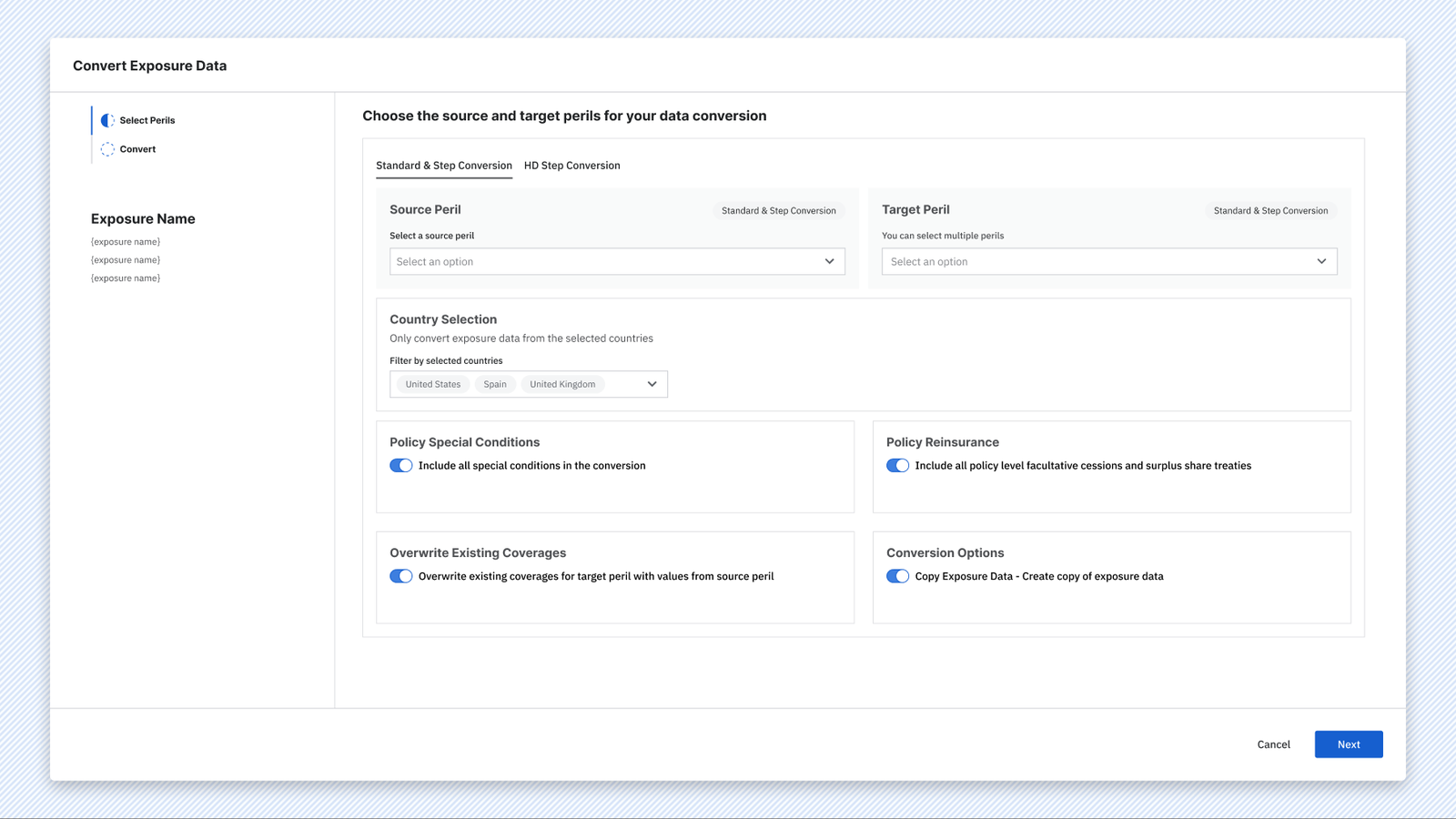
Problem. Converting exposure data from one peril to another rewrites records across an entire database. Portfolio managers were doing it in bulk, across many portfolios at once, with a configuration surface that did not tell them what they had chosen or what had actually happened afterwards.
A two step flow inside one modal. Step one is configuration, step two is a confirmation that reads back the decision in plain terms before anything is written.
- Source peril is a single choice, target perils are a multi select, because one source can legitimately map to several targets. The picker shows how many are available and offers Select all rather than making people tick twelve boxes.
- Country selection narrows the conversion to the regions that matter, with the chosen countries shown as chips rather than a count.
- Four behaviours sit as plain toggles with a sentence each, covering special conditions, policy level reinsurance, overwriting existing coverages, and whether to work on a copy.
- The confirmation lists only the options that were switched on, not every setting. It names the database, the record count, and the exact source to target mapping, under a banner that says the operation will modify the database.
- After the run, the job carries its own summary. Source peril, target perils, regions and location count sit next to duration and owner in the jobs view, so weeks later the record still explains itself.
Risk Modeler and ExposureIQ
Accumulation profiles across the product boundary
Problem. Accumulation is an ExposureIQ capability, but Risk Modeler users need it too, and not all of them own ExposureIQ. Three different routes to the same task depending on licence: Risk Modeler alone, Risk Modeler with an ExposureIQ entitlement, or ExposureIQ directly. Handled badly this becomes three inconsistent flows and a support burden.
One four step profile builder, launched from wherever the analyst already is. Analysis Type, General Settings, Scope, Damage, with a running summary in the left rail that fills in as you go so the profile is legible before it is saved.
- The Scope step pairs a geographic hierarchy, country through CRESTA, admin levels, city, postal code and predefined zones, with a live map, so a selection you cannot picture from a dropdown is visible immediately.
- The version running inside Risk Modeler says so, in the footer of the modal: this is a subset of the accumulation capabilities from ExposureIQ, with a link to what the full product does.
- That line is the whole design decision. Rather than hiding the ceiling or pretending parity, the flow is honest about which capability set you are in and where the rest of it lives. It keeps the Risk Modeler user unblocked without misleading them.
- Entitlement states were designed explicitly, so what an admin sees with and without the add on is a designed screen rather than a gap.
ExposureIQ
Stopping a run to tell the truth
Problem. An accumulation runs across a business hierarchy, a tree of insurance and reinsurance entities with portfolios attached. Every portfolio needs at least one variation. Sometimes they do not have one, and the product used to start the run anyway.
A full page interrupt in the tab the analyst is already watching. One sentence explains the situation and the two ways out. Two cards follow, one giving the count and a way in, the other giving the cost of the easy option, which is time.
- The detail view names every affected portfolio against the node it sits under. The error is identical on every row, so the table adds no diagnosis at all. What it adds is identity, because the real question is not what went wrong, it is which of mine and where.
- Continue is a button and going back is a link. That is deliberate. The system genuinely can create the variations and the only cost is a slower run, so the design says so rather than making the analyst feel they have broken something.
TreatyIQ
Contract correlation, a matrix that will never fit
Problem. Reinsurance analysts wanted to know which contracts in a programme move together. That is every contract compared against every other contract, so the report grows as the square of the book. A programme of sixty contracts is thirty six hundred cells.
Two representations behind one toggle. A heatmap answers where to look. A table answers what the number is. Neither pretends to do both, and filtering is the primary action rather than a refinement.
- The filter panel sets which contracts sit on each axis and a numeric band, greater than and less than. You do not navigate the matrix, you shrink it until it is readable.
- Cells carry colour only. Hovering gives the two contract names and the percentage, tested against the longest programme names in the data because reinsurance naming conventions are brutal.
- Correlation is expensive to compute, so it ships as an opt in output alongside four other new reports, cumulative expected loss, largest events, participation run off and contract schedule.
- Off by default creates its own risk, so the setting is shown again in the preview before the run and again in the summary afterwards, next to the run date and owner. A result that sets capital has to carry its own record of how it was produced.
Shared across all three
Data organisation and tagging
Problem. Analysts had flat lists. Thousands of portfolios, profiles and results, sorted by date, found by scrolling. Folders were the obvious fix but the wrong one, because a portfolio genuinely belongs to several things at once. It can be 2024, North America and High Priority all at the same time.
Grouping built on top of tagging. Select rows in any table and the toolbar offers to add tags, update them, remove them, or add the selection to a group. A group is a rule over tags rather than a folder, so it stays current on its own.
- Because a group is a rule, adding items to it has to tag them so they match. The confirmation says so in plain English, and says something different depending on the rule. If any one of several tags will do, it says so and lets you drop the ones that do not apply. If a combination is required, it shows the valid combinations as a short list and asks you to pick one. Nobody is asked to read a query.
- A switcher at the top of the sidebar moves between all data, personal groups and shared tenant groups. Scope is chosen at creation, and shared groups carry owners, editors and viewers including whole role groups.
- Groups hold sub groups. Nesting is a drag, with a grip handle and an insertion line, so reordering and re-parenting are one gesture rather than two ideas.
- Duplicating a group sits on right click, because people make variants of a working set constantly and it should not compete with the primary actions.
- Some analysts think in databases and some think in entity types, so the tree offers both rather than picking a winner.
Outcomes
- 3 Products on one shell
- 8 steps Chained into one saved template
- 4,292 Rows a single view stays usable at
Three products that were built separately now share a shell, a component library and one way of organising data, shipping together on the same release train. None of the six features above added a mode, a wizard or a settings page. Enterprise software gets hard to use by accretion, and every one of these took something out and replaced it with a smaller, plainer surface.